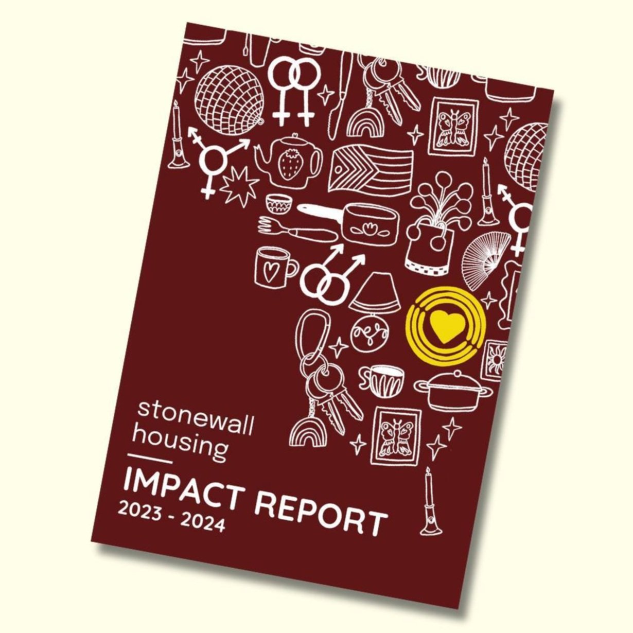
In September 2024 was commissioned by Stonewall Housing to help level up their branding. The goal was to make the brand feel more personal through illustrations that represented the idea of ‘queer home’. The design was constructed as a repeat pattern as well as being used as individual elements.
These illustrations have been used across social media assets, printed booklets, promotional material and across the majority of the charities branding to give it a more personal feel.


The final artwork for this project was a vectorised repeating pattern for the clients to be able to use and manipulate in a way that worked across all of their social media.
The pattern itself include motifs that relate to queer history, such as the carabiner, lavender, a fan and a disco ball. As well as a number of objects that symbolise home, including keys, mugs, plants and lamps.
Overall the design reflects that values and aims of the charity and the hand drawn illustrations give their branding a more personal and community feel.


